Hadrian’s Wall Relief Prints — Progress Update
This new set of three relief prints began as a simple idea: to create companion pieces to my earlier Sycamore Gap print. I wanted to explore other views along Hadrian’s Wall — perspectives that would complement that iconic scene while standing on their own.
I’m tempted to try a block where I have cut the Sycamore Tree out, or leave it to turn it into a ‘ghost tree’ …
The journey so far:
We were staying in Northumberland three weeks ago. We rented a cottage from the Belsay Estate, a lovely isolated Northumberland farmhouse surrounded by a shelter belt of veteran Ash tress, in field, down a track through a field. It should be inspiration for drawings and prints galore. Similarly St Andrews, a Saxon Tower and 13th Century Church. I went there with the purpose of sketching out a print marrying the old stone work and structure with two huge sycamore trees behind it, one with a girth of 5.7m likely to be upwards of 200 years old.
We came home to Sussex via the Military Road, parallel to Hadrian’s Wall. I’m Northumberland born and bred, educated at Mowden Hall (Newton, nr Stocksfield) and then the other side of the Pennines at Sedbergh, so I know this road, and the roads east to west well. This is my favourite route; I rarely take the A69 unless time is of the essence, and depending on my destination, the over-the-top route via Alston is a worthwhile trip.
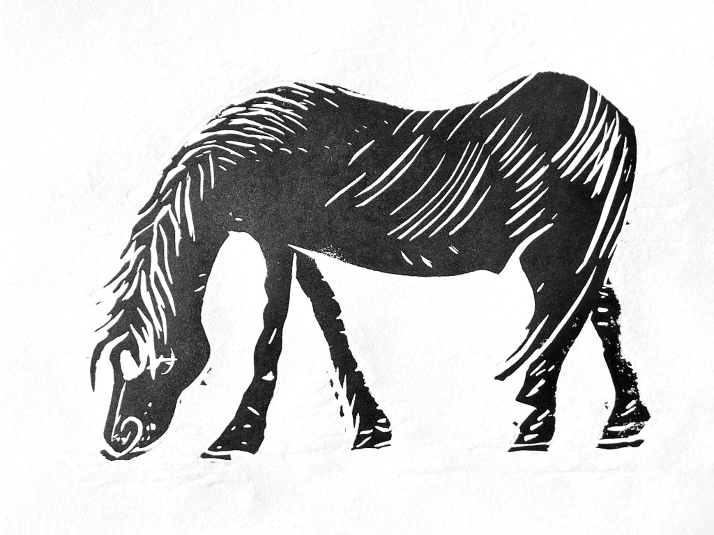
The sycamore gap is no more; it is now just another dip against the skyline. It fascinates me how we mourn a lone sycamore tree, not a very old one, not worth a mention in something like the Woodland Trust Ancient Tree Inventory, which I have been working on as a Woodland Trust Volunteer Tree Surveyor for a couple of years.
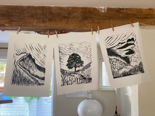
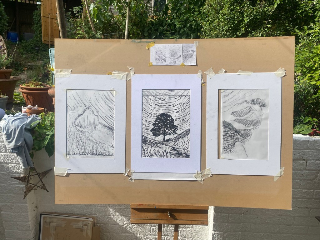
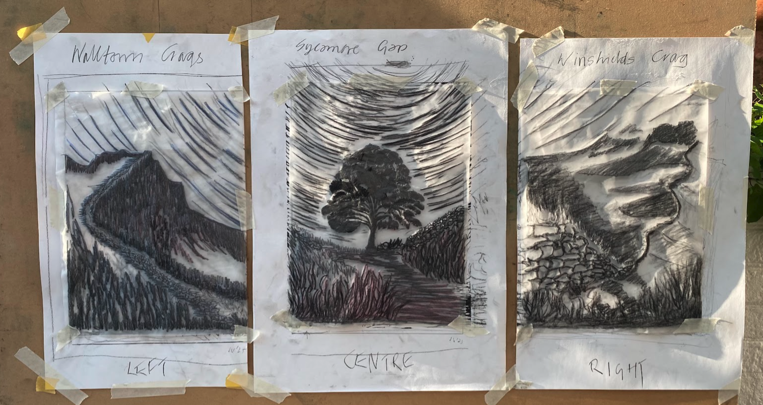
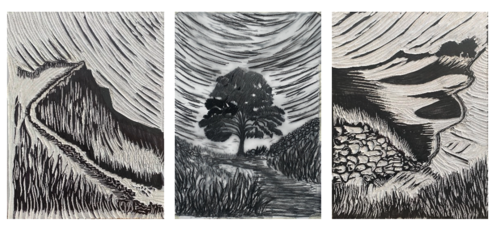
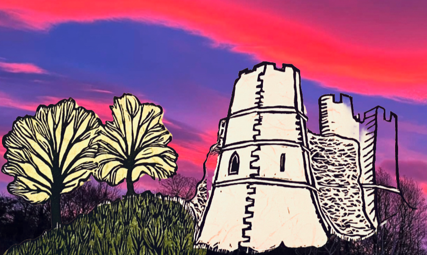
The idea of three pictures, or a Triptych, came as a result of a call from The Depot, here in Lewes, asking artists to submit ideas for Artwave this September on the theme of ‘Structure’. I like the idea of how Hadrian‘’’s Wall could stitch together multiple prints. I could add more, but the entrance fee and guidelines stipulate three entries. I suppose if I hung the two outer pictures against the central one, that would be a single entry.
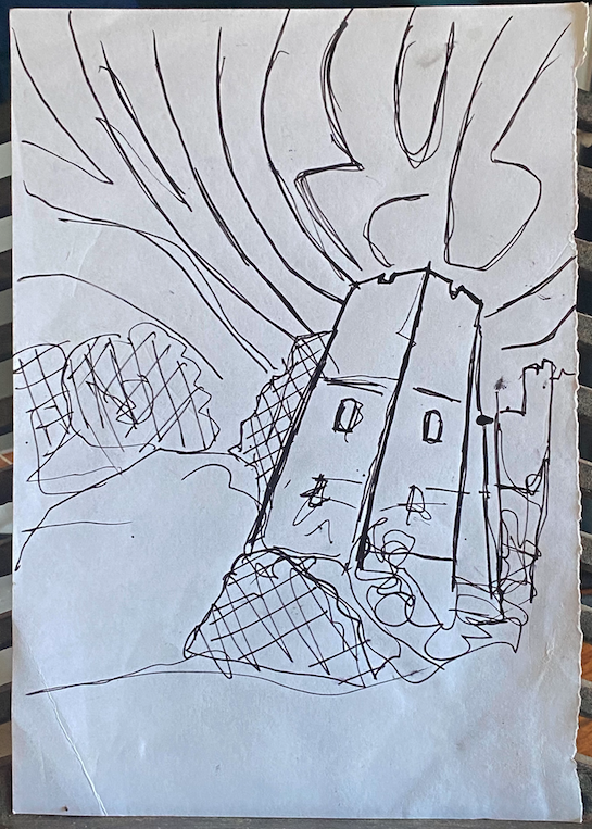
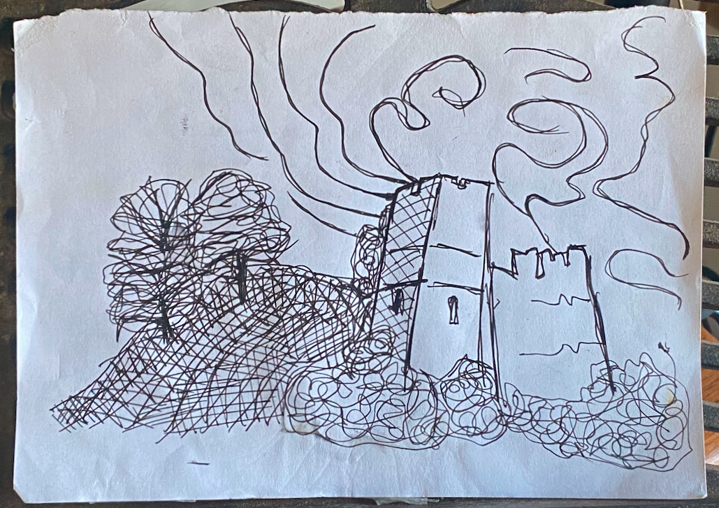
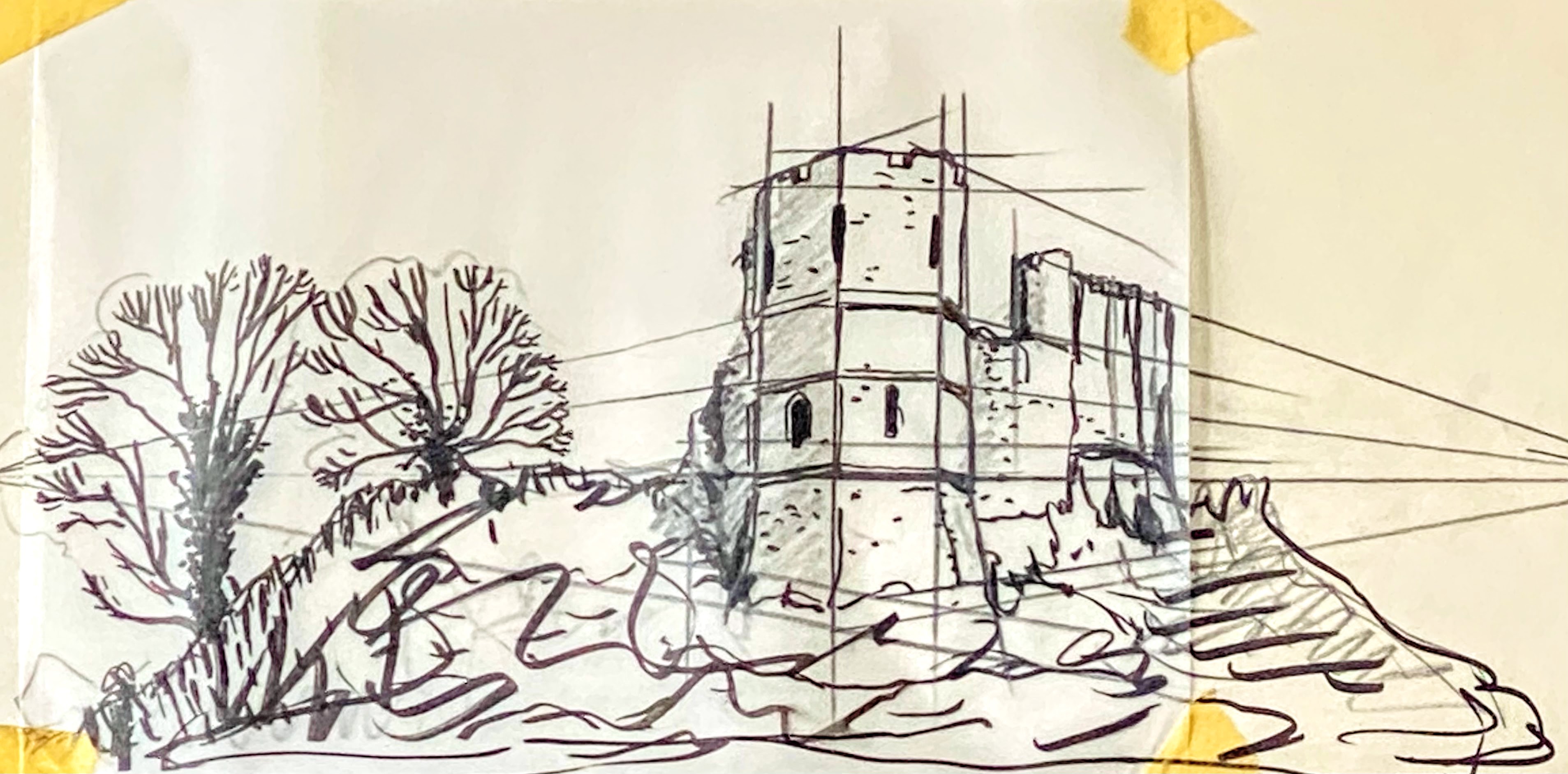
This is my first doodle. It’s what I refer back to still, the intent to capture a sense of the rollercoaster that is Hadrian‘’’s Wall, and the Military Road.

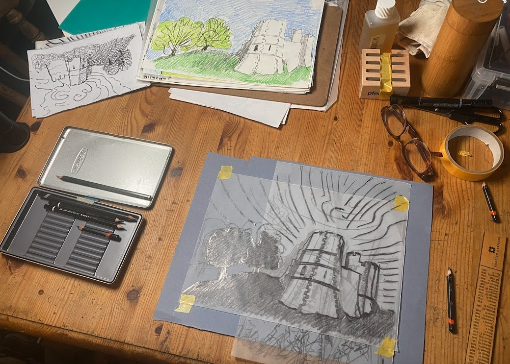
First ideas — settling on viewpoints that would balance drama, history, and landscape. Scamps — quick sketches to explore layout and composition.
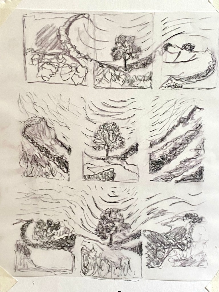
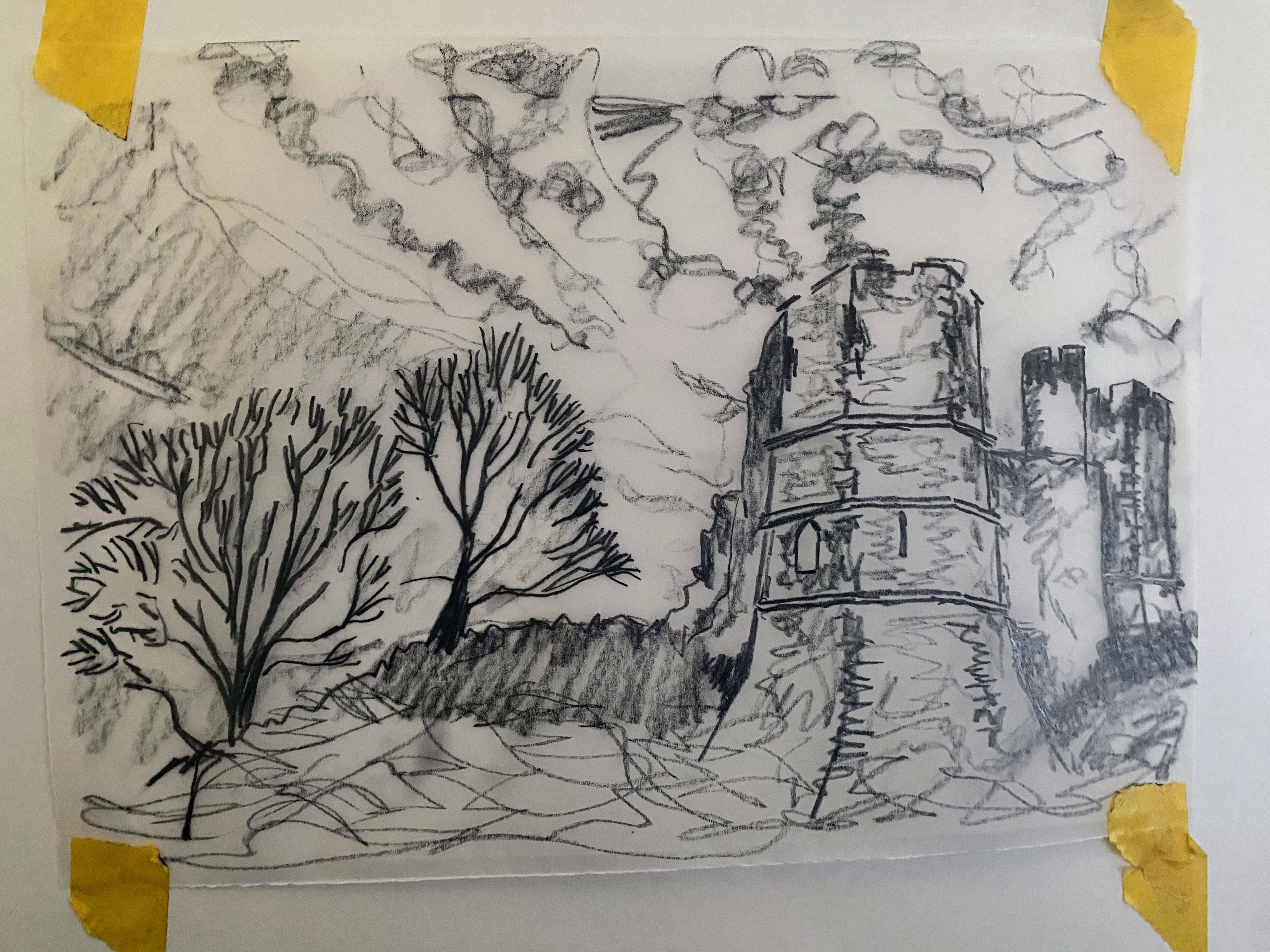
Drawings to size — refining each image so it would fit comfortably onto a prepared block.
Block preparation — Lino sheets glued to 3 mm MDF for stability.
Experimentation — playing with how the wall, sky, and land might interact in carved form.

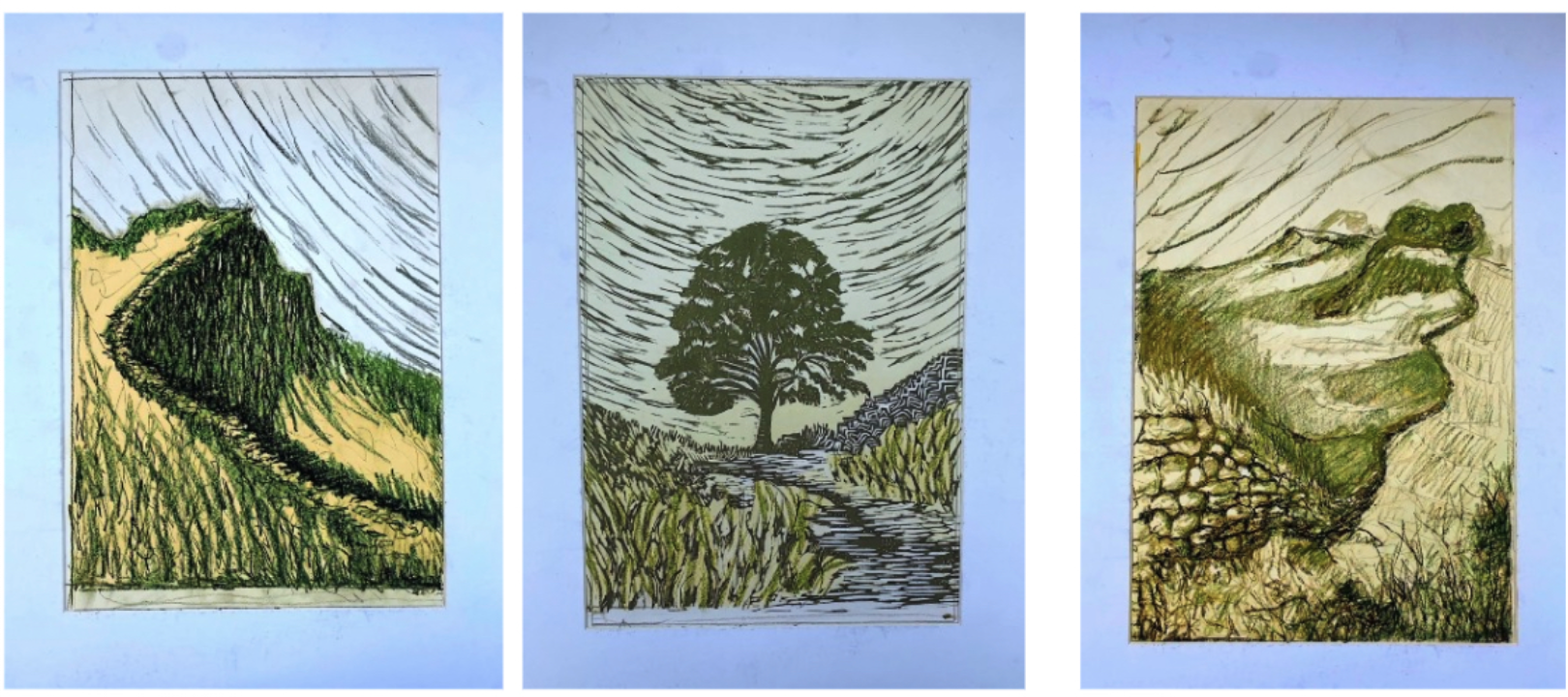
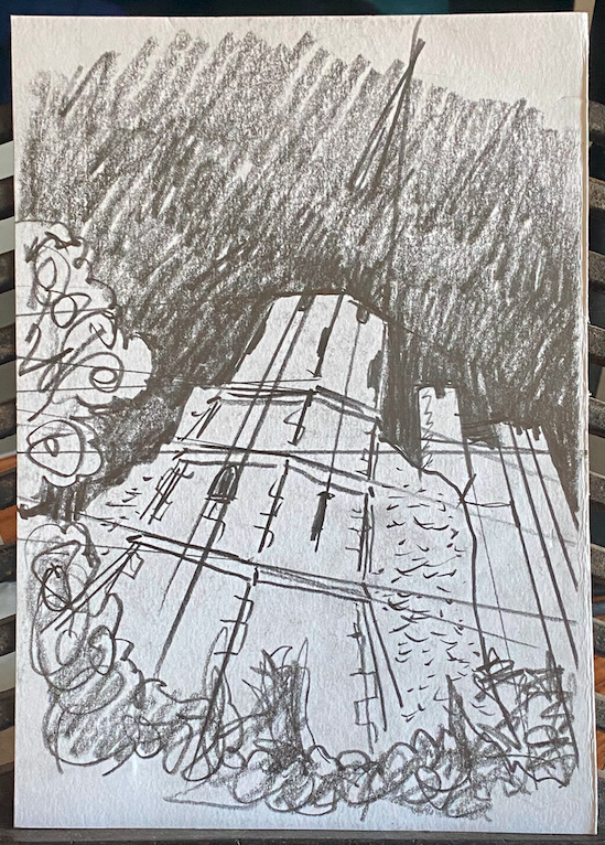
Tracing paper versions — to check proportions and guide the transfer. Transfer to lino — reversing the drawings for carving.

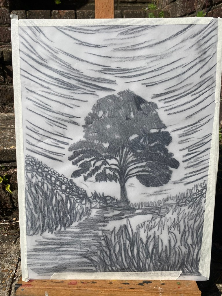
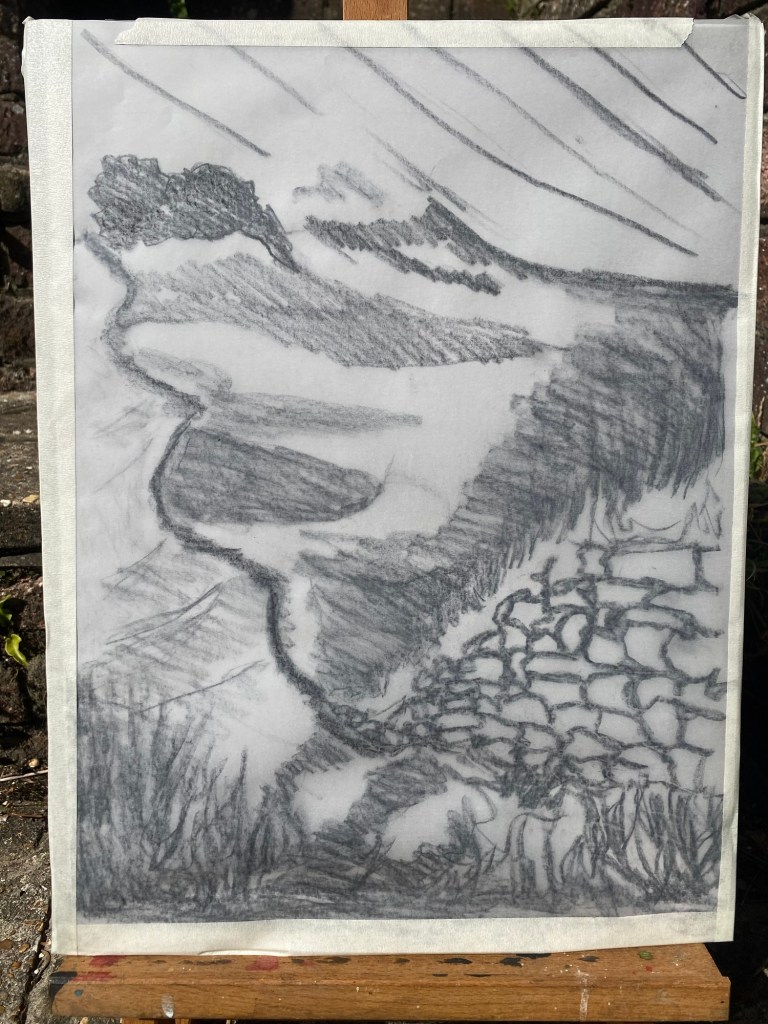
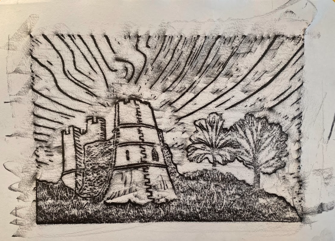
Once etched onto the Lino block by marking over these pencil drawings (always 6B soft pencils or charcoal pencils) I was intrigued by the impression made on the tracing paper, which in the low evening sun gave a 3D effect across the drawing board.
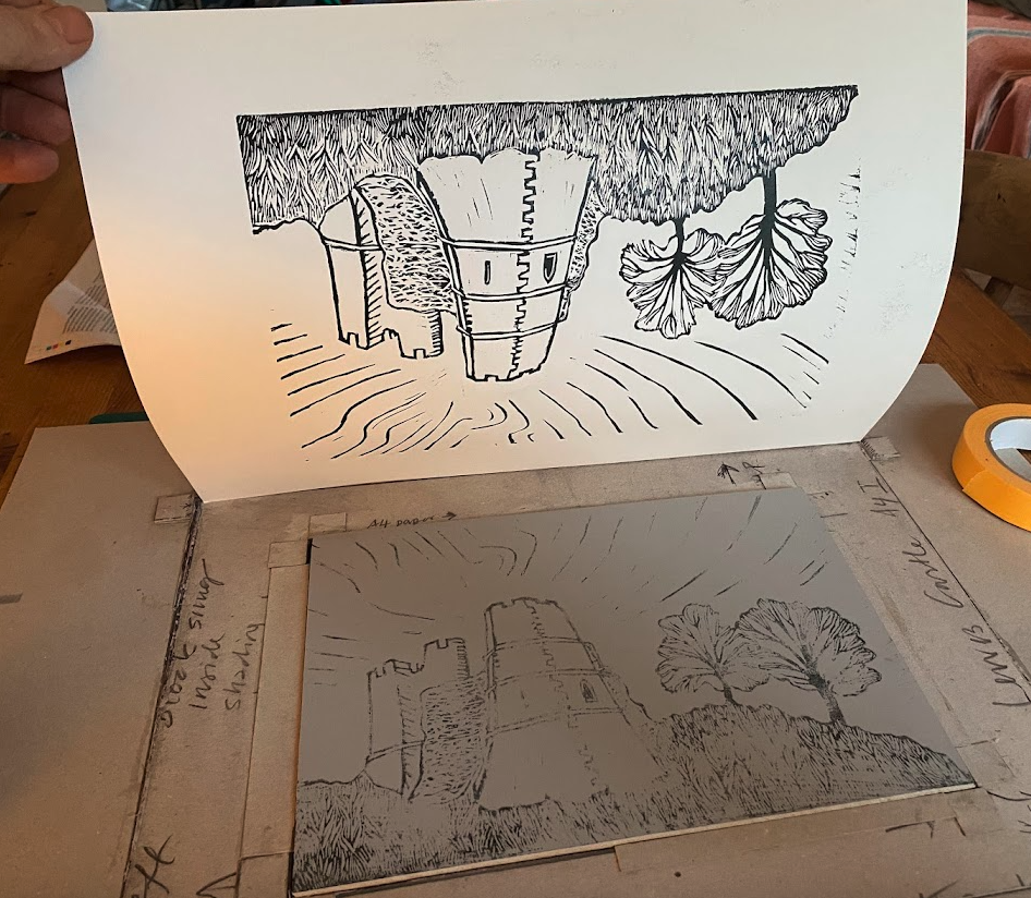
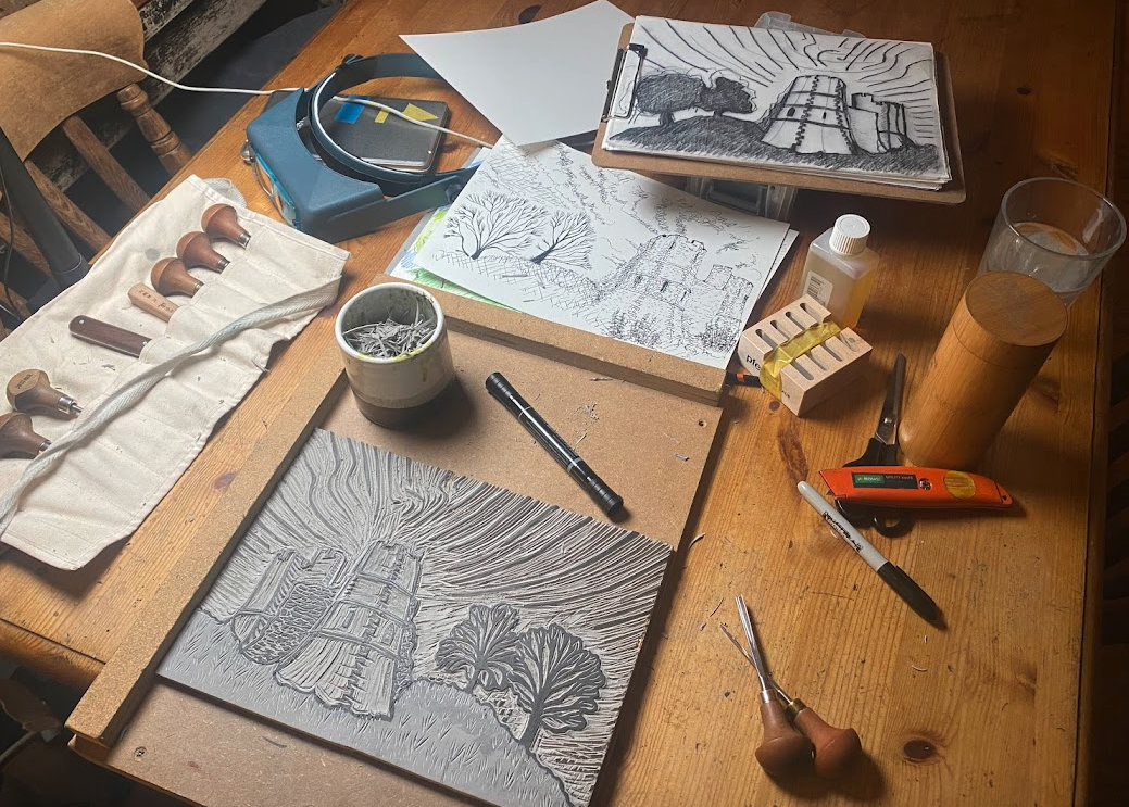
Cutting — slowly bringing each design to life, line by line.
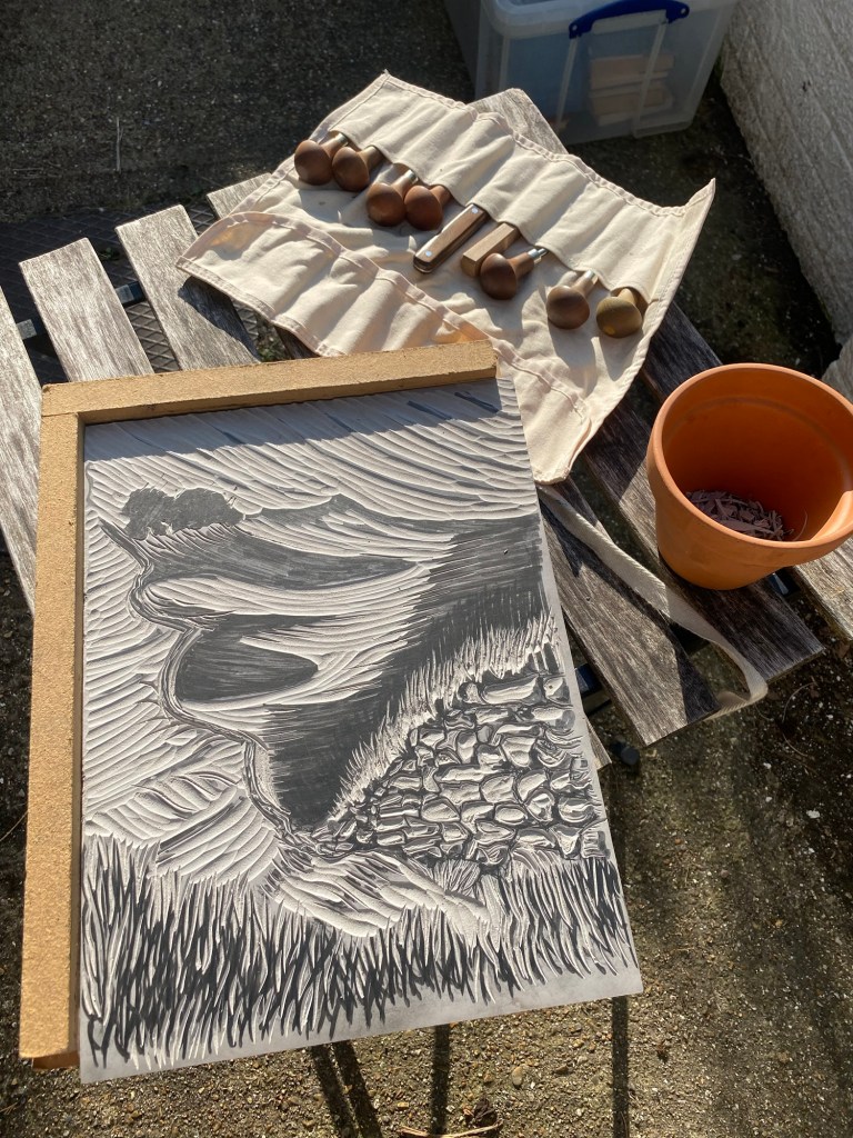
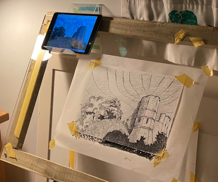
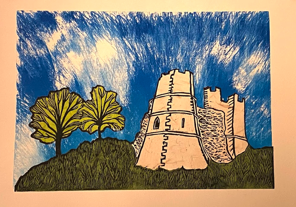
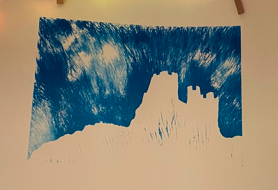
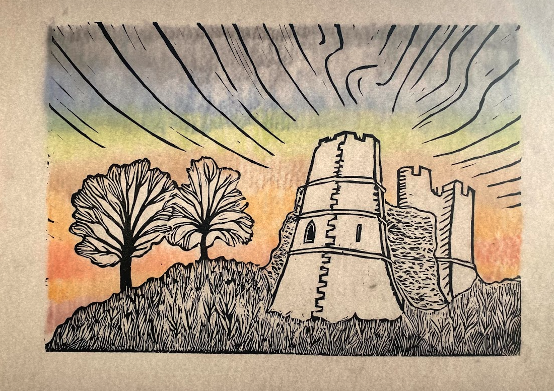
Test prints — first hand prints in Payne’s Grey on cartridge paper to reveal where the carving works and where it needs refinement.

From here, the plan is to fine-tune the carving, explore colour layers, and print onto archival paper. I’m also editing a short 30-second video showing the whole process — from first sketch to finished print — which I’ll share soon across Facebook and Instagram.
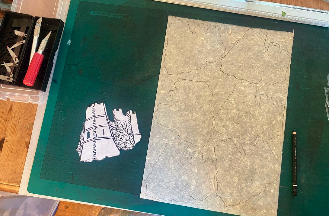
I don’t hesitate to drop photos of my work, at different stages of progress, into Geni GPT to create mock ups of what I am doing. It has not got the idea of Chin Collée at all; I suppose it would need exact paper sizes, cut positions. What I may do is use Adobe to do this in several layers. When I get to adding colour I’ll try different coloured papers and cuts, and then make a cardboard stencil so that I can cut a dozen pieces of each colour to the same shape and size. This can become baffling, so I mark up the stencil and keep all the pieces in separate trays.
I’ll walk all of Hadrian’s Wall one day – rather than doing it in bits over decades. Sketch book always to hand.
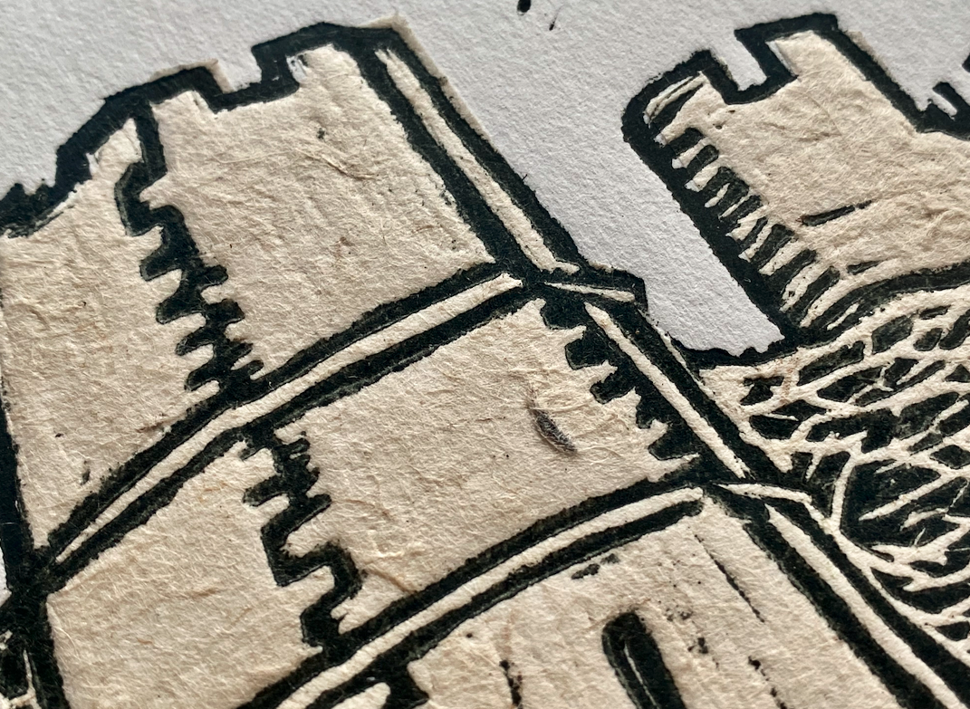
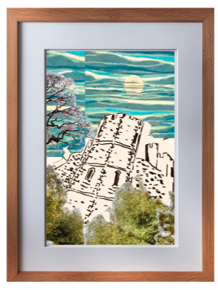
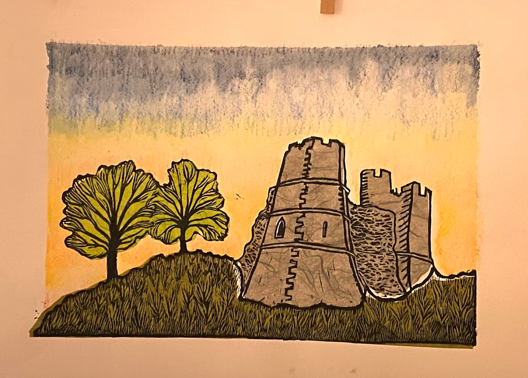
I’ll refine the cut in the next day or so, then print again. From a ghost print, I’ll then pick colours, likely to be moss green, light green and straw yellow. I may use a mottled handmade white/beige paper that can add to the stone effect (I used it on my Lewes Castle print).

Turning Coffee into a Gallery – My Prints Now Showing at The Forge, Ringmer ☕🖼️

This afternoon I visited The Forge in Ringmer, a rustic gem of a coffee shop tucked away in the Sussex countryside. I wasn’t just there for the coffee and cake (though both are excellent!)—I was there to hang a show. With the generous support of the team at The Forge, I’ve turned a wall of their café into a small but characterful gallery space for a selection of my framed lino prints.
The atmosphere is relaxed and intimate: exposed brickwork, vintage lighting, and a welcoming mix of seating. It’s exactly the kind of setting I love—where art feels like part of the everyday, not something set apart.
Featured on the wall:
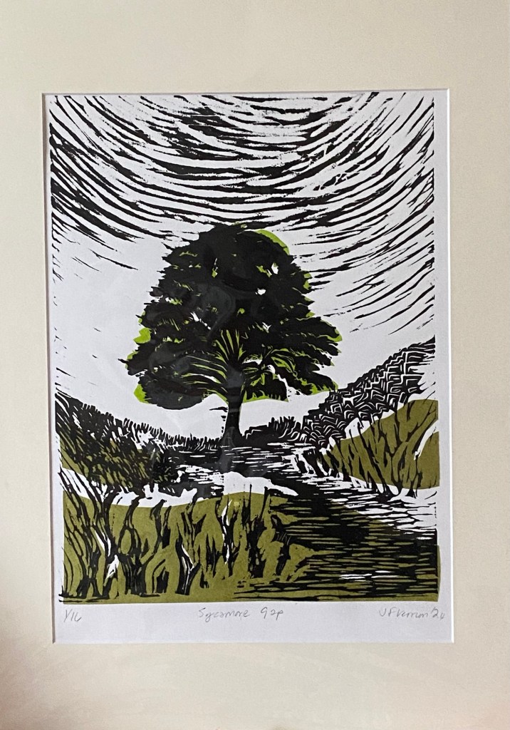
Sycamore Gap – my tribute to the iconic tree lost in 2023, printed using the chine collée technique.

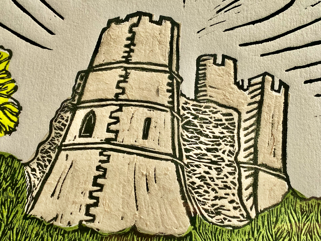
Lewes Castle – a dynamic print based on years of sketching, walking, and quietly studying this ancient landmark.
Plus a few other favourites.
Each print is hand-cut and hand-printed, framed and tagged—ready to view, enjoy, or take home.
If you’re local (or fancy an outing), do drop by. Grab a coffee (the best is Sussex), find a quiet corner, and spend a few minutes with the work. I’d love to hear what you think.
🗓️ On show throughout the summer
Creative Printmaking Journey: Lewes Castle Perspective
A Journey Through Perspective, Experimentation, and Printmaking
First Encounters: Sketching Lewes Castle
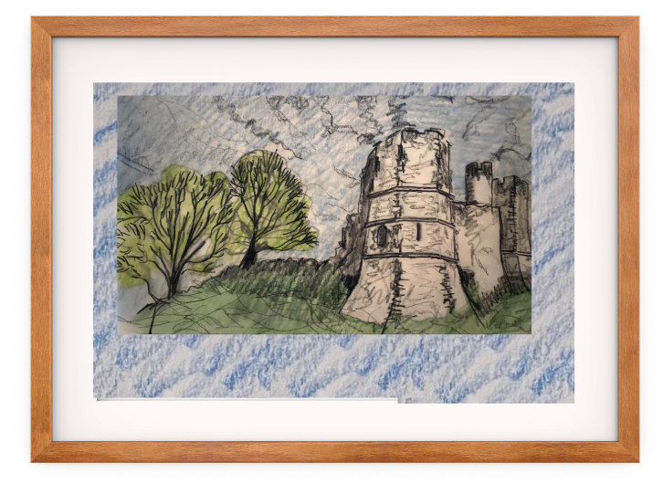
I’ve lived in Lewes for 25 years. We came here in May 2000 with our three-year-old daughter and one-year-old son. We lived on New Road below the castle. I’ve been drawing and photographing it ever since. To create this print, I examined every conceivable angle, its location on the mound, and its relationship with the trees, the grounds, and the sky. I wanted to avoid cliché. Other outcomes are a pencil sketch in snow and a print of the Barbican.
Perspective Challenges
I wanted drama without adding a thunderous cloud or cosplay men with swords in the foreground! I knew I could do this by getting the angle of attack right. I have a fish-eye lens, so I took pictures of the castle that way. I even took a series of 360 photos. To accurately capture the geometry of the castle, I then initially attempted a two-point perspective. I have used Apps before and have an ancient lightbox to work from, but that was too small, so I constructed my own window-frame lightbox and a light frame. We’re blessed with a south-facing house, so I sit at the window with paper taped to this perspex frame and alternate between tracing paper and layout paper. When I struggled to get the vanishing point far enough away from the sketch, I used a plank of beech wrapped in wallpaper baking paper! All this is to get the perspective lines extending far from the picture.
I deliberately distorted the view to evoke drama, embracing a more imagined, fisheye-like curvature and exaggerating the tower’s prominence. Eventually, I experimented with AI-assisted geometry to create a hexagonal stone tower, which helped me visualise how exaggerated distortion could function without losing the hexagon’s originality.


Referencing Other Printmakers
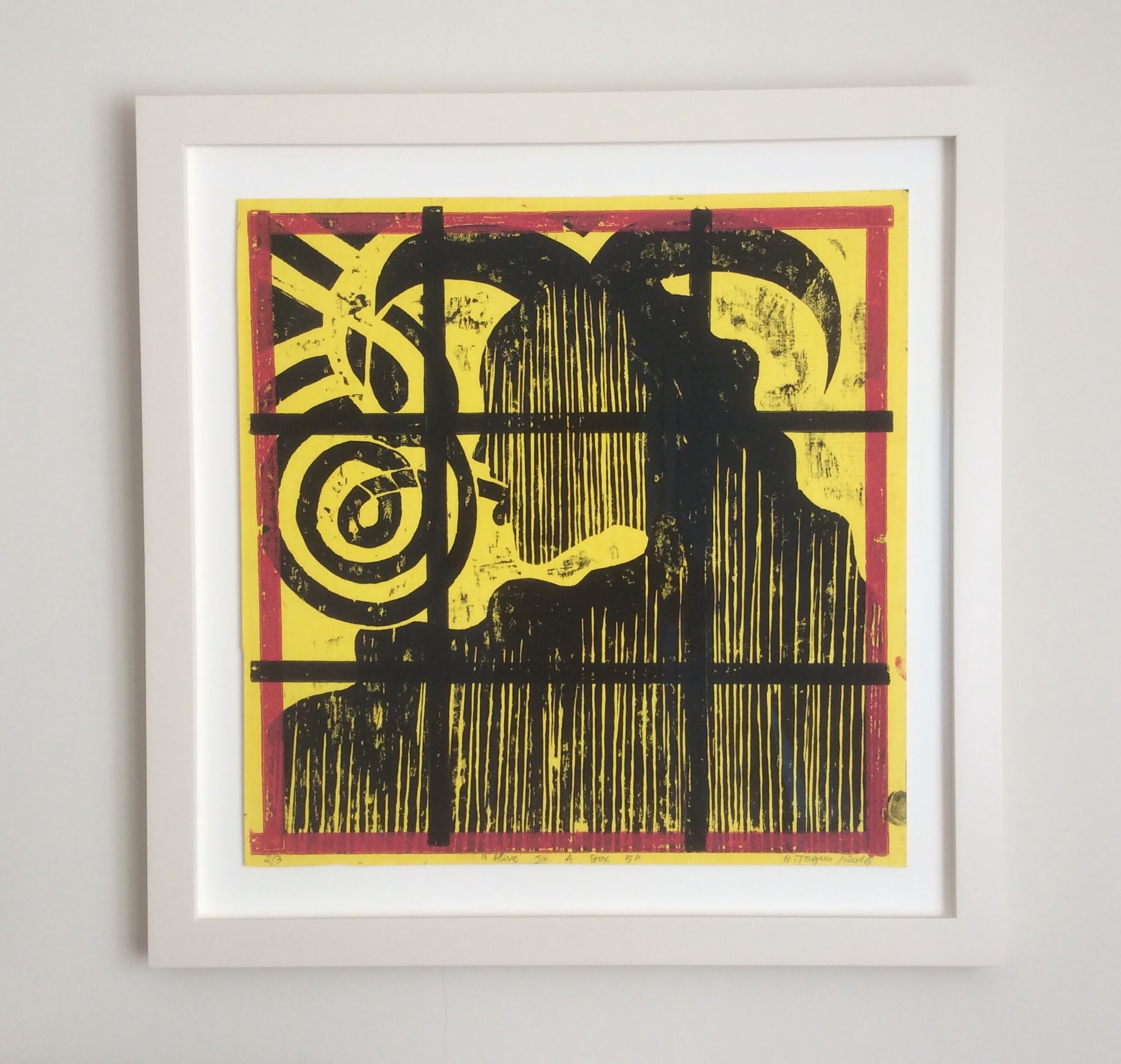
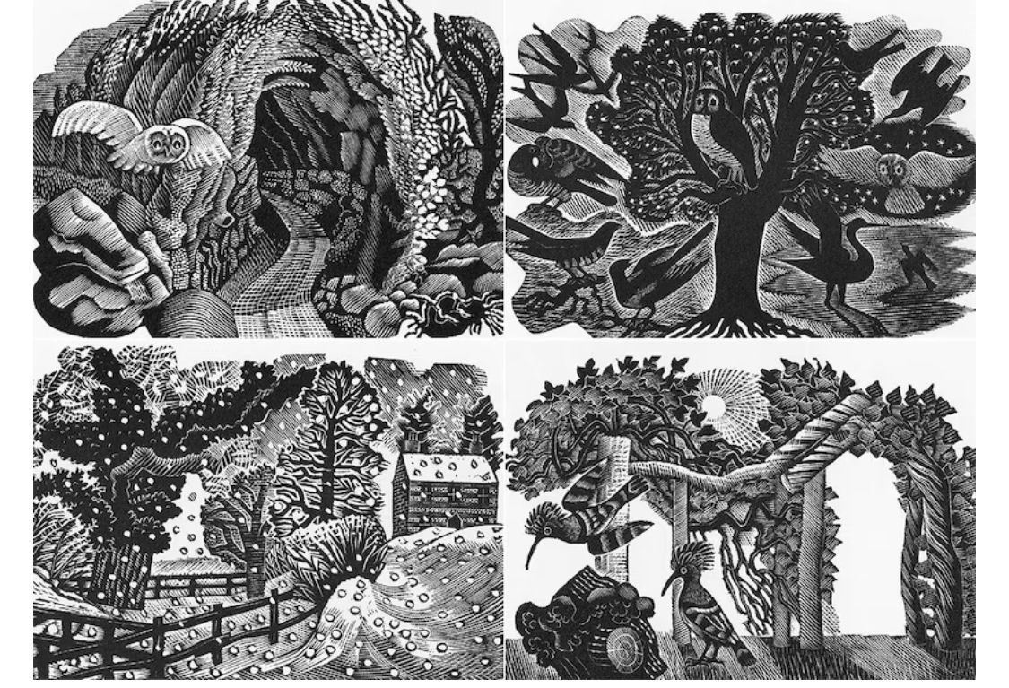
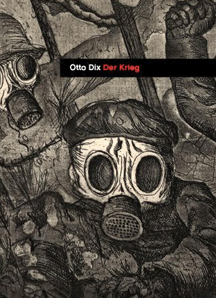
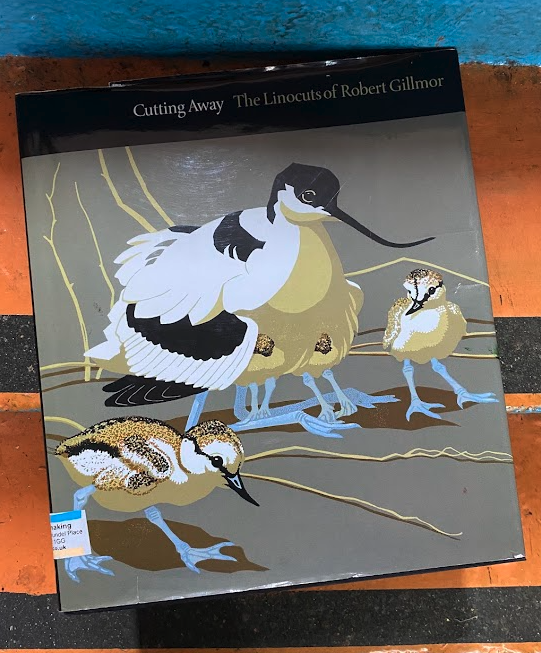
Before cutting into lino, I researched printmakers’ past and present work, studying figures such as Carolyn Trant (Lewes printmaker), Barthélémy Toguo, whose work I admire (and own), Angela Harding, Eric Ravilious, Otto Dix, Matisse, Robert Gilmor, and Lewes Artist Michelle Hockey.
- I explored line weight and carving techniques to suggest texture.
- I managed skies—from stark simplicity to elaborate swirling motion. Helen Brown inspires my contoured chatter.
- I balanced solid areas of ink with carved negative space.
Influence on My Work: I aimed for a bold, dynamic sky, a sense of weight in the castle, and energy in the composition.


Compositional Mock-ups and Playful Experiments
Before carving, I tested layouts using Adobe Express, experimenting with:
- Sky compositions—straight lines, curved distortions, radiating patterns.
- Tree placement—how much foreground weight felt appropriate.
- Frame size tests—how different mounts and frames affected the final feel.
It’s taken me a year or two not to rush into cutting the block. There is nothing worse than going through the many hours of cutting any block, large or small, only to find the print doesn’t work or sit right or has simple errors that could only have been corrected in the first sketches and tests. What I do now is have a period of play. Is this designed to be a chin colée relief print, or is it something else, a mono print, a reduction print, or a jigsaw print? Is landscape the right way to do this, rather than portrait?
The Wild Experiments:
- A silver sky—ethereal but ultimately too overpowering.
- A silver castle—intriguing, yet it lost the stone texture.
- An aquarium version—mound, castle, and trees submerged like a ceramic ornament.


Carving and Testing the Print
Moving from digital to physical:
- First test prints: Adjusting line depth and checking ink coverage.
- Chin collée elements: Deciding where to add layers of subtle colour.
- Final refinements:
- How much to ink the sky versus leaving open space.
- Balancing sharp, architectural lines with softer organic textures.
- Print on Fabriano Artistico paper for optimal texture and ink absorption.
- Heading into Bip-Art to print and chat with other printmakers.


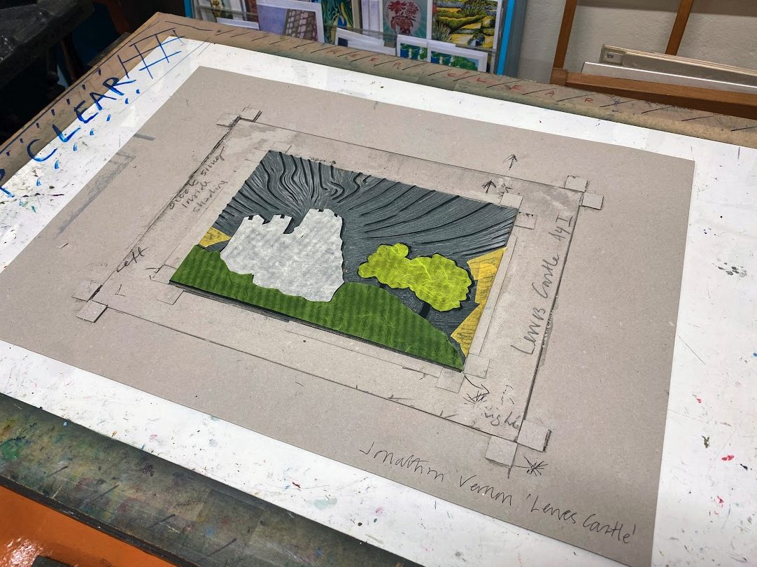


The Finished Print and Reflection
After six or seven weeks of iterations, experiments, and adjustments, I settled on this 1/12 edition.
What I’ve Learned:
- The balance between precision and playfulness allows space for surprise.
- The unexpected joy of experiments, even if they don’t make the final cut.
- Studying other artists’ work to advance my style.