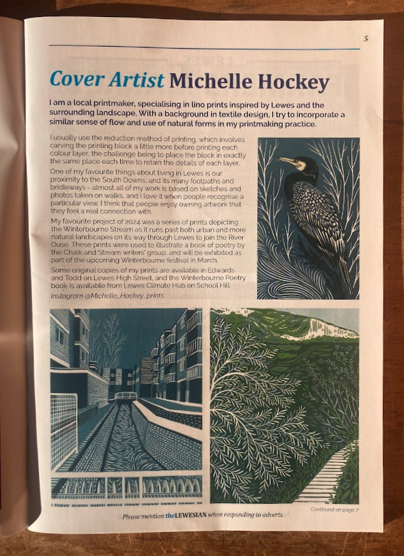
Creative Printmaking Journey: Lewes Castle Perspective
A Journey Through Perspective, Experimentation, and Printmaking
First Encounters: Sketching Lewes Castle
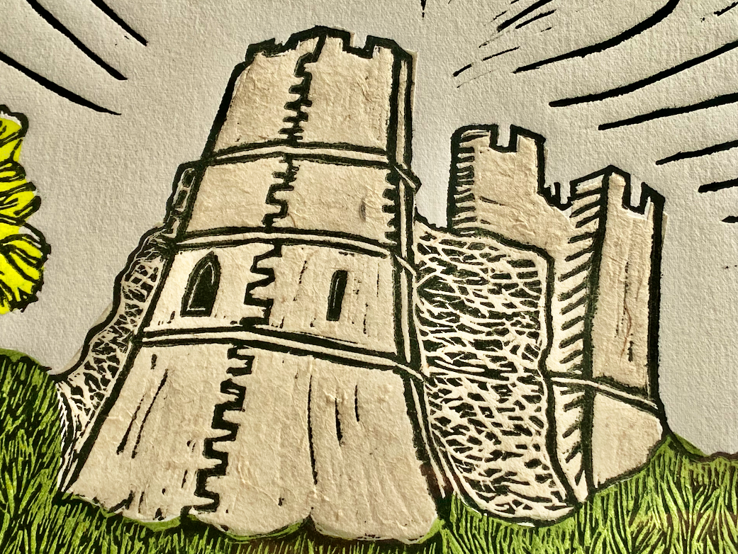
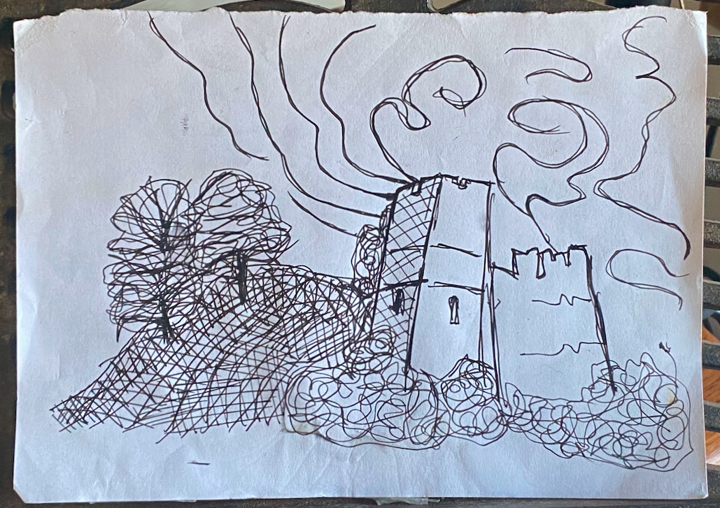
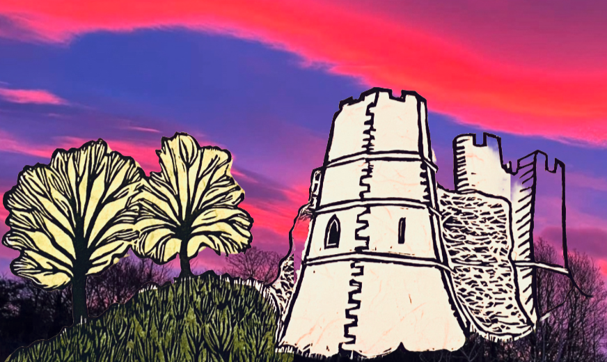
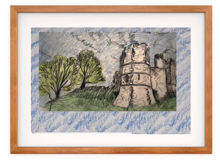
I’ve lived in Lewes for 25 years. We came here in May 2000 with our three-year-old daughter and one-year-old son. We lived on New Road below the castle. I’ve been drawing and photographing it ever since. To create this print, I examined every conceivable angle, its location on the mound, and its relationship with the trees, the grounds, and the sky. I wanted to avoid cliché. Other outcomes are a pencil sketch in snow and a print of the Barbican.
Perspective Challenges
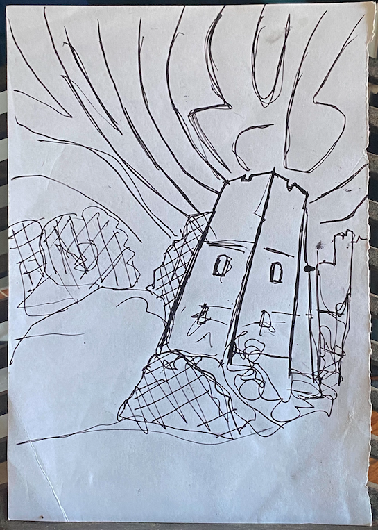
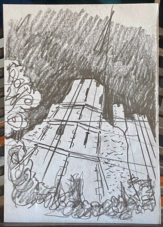
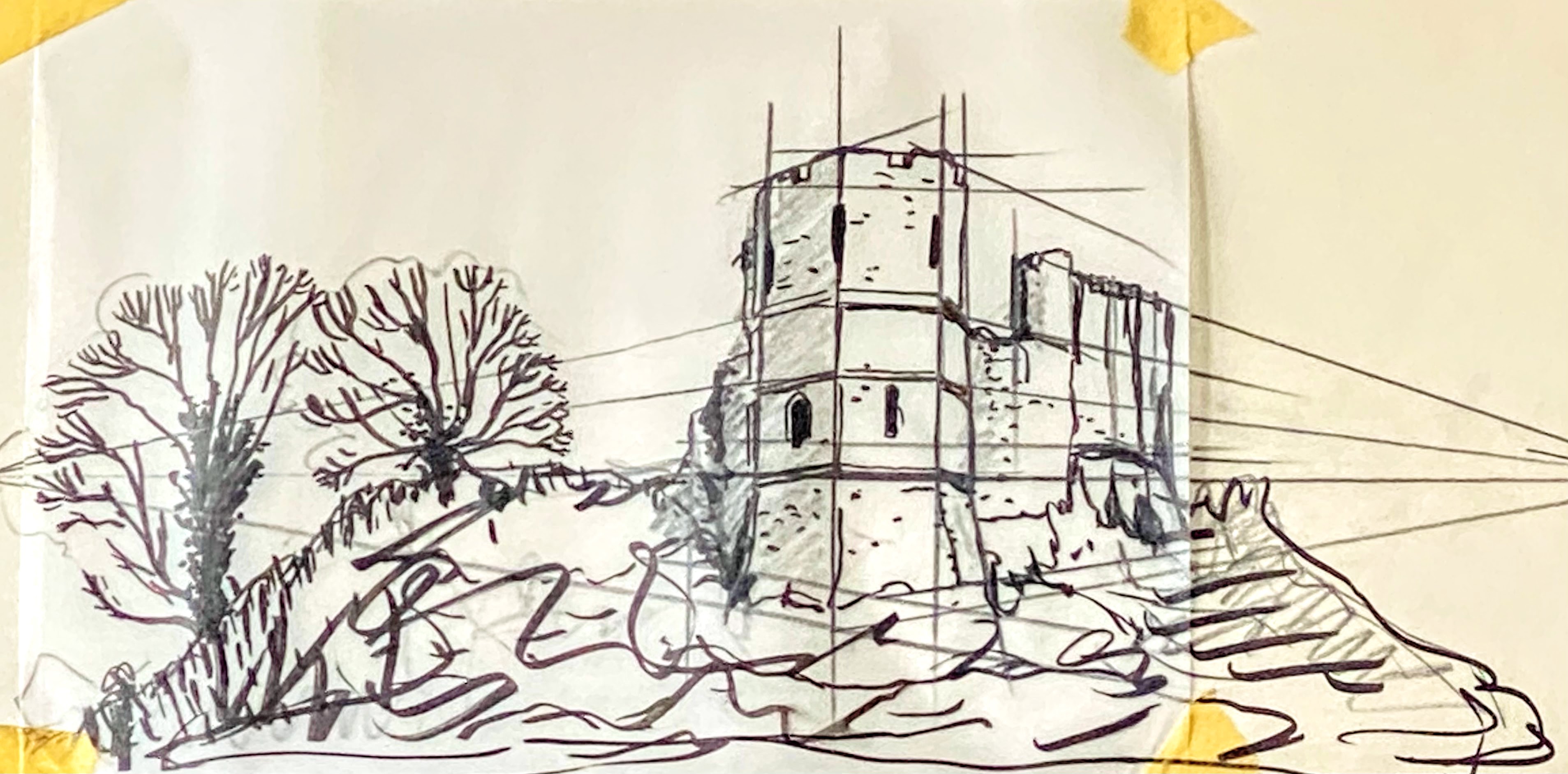
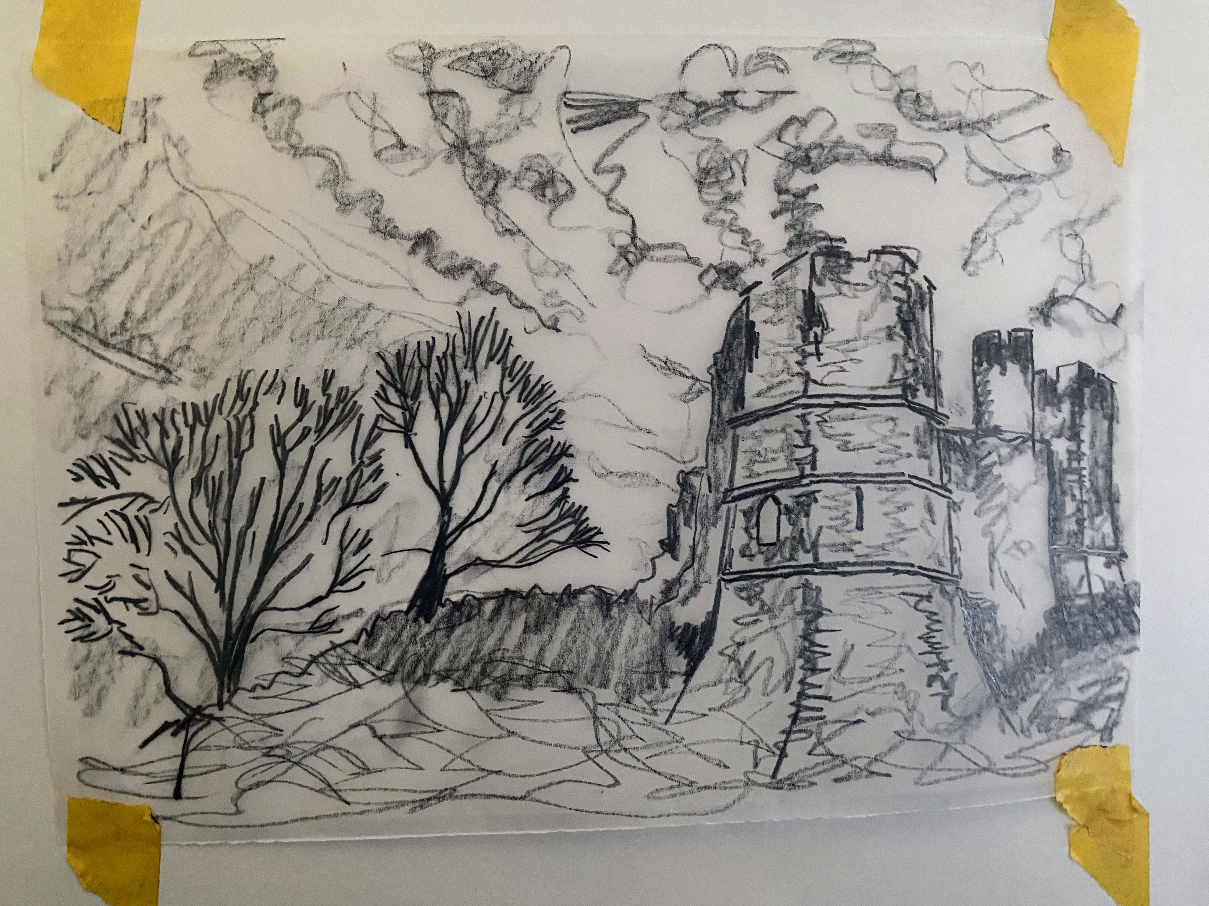
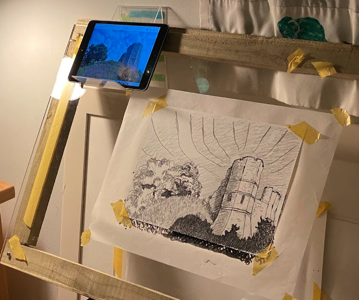
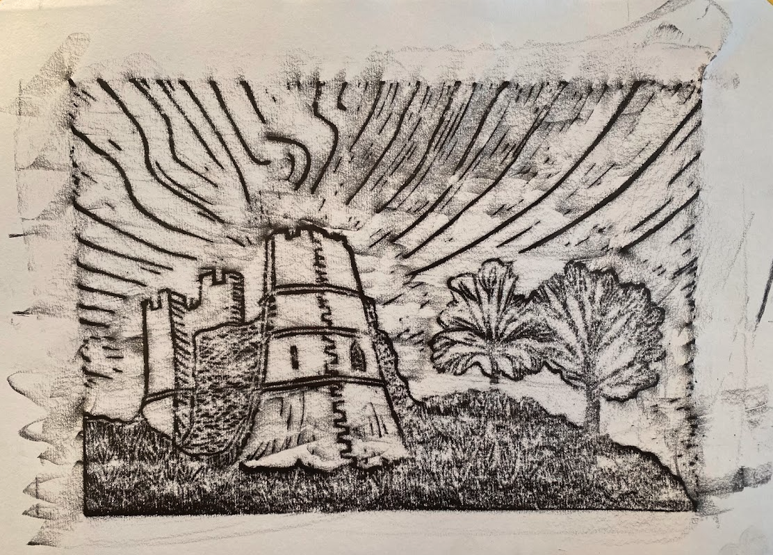
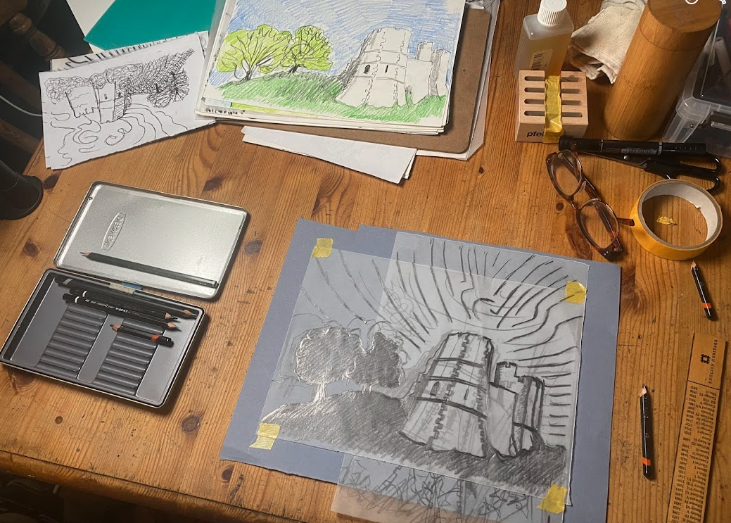
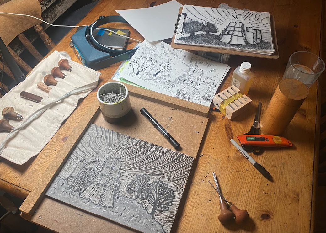
I wanted drama without adding a thunderous cloud or cosplay men with swords in the foreground! I knew I could do this by getting the angle of attack right. I have a fish-eye lens, so I took pictures of the castle that way. I even took a series of 360 photos. To accurately capture the geometry of the castle, I then initially attempted a two-point perspective. I have used Apps before and have an ancient lightbox to work from, but that was too small, so I constructed my own window-frame lightbox and a light frame. We’re blessed with a south-facing house, so I sit at the window with paper taped to this perspex frame and alternate between tracing paper and layout paper. When I struggled to get the vanishing point far enough away from the sketch, I used a plank of beech wrapped in wallpaper baking paper! All this is to get the perspective lines extending far from the picture.
I deliberately distorted the view to evoke drama, embracing a more imagined, fisheye-like curvature and exaggerating the tower’s prominence. Eventually, I experimented with AI-assisted geometry to create a hexagonal stone tower, which helped me visualise how exaggerated distortion could function without losing the hexagon’s originality.


Referencing Other Printmakers
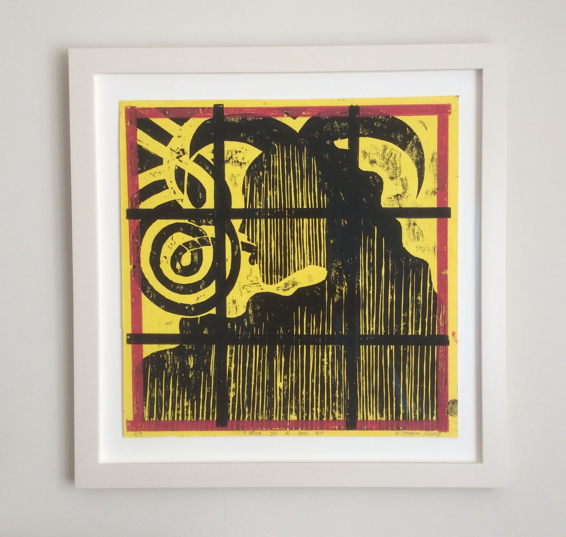
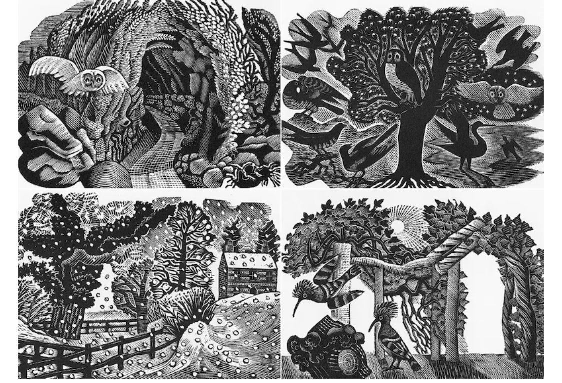
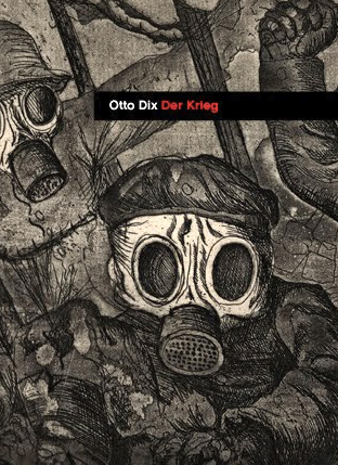
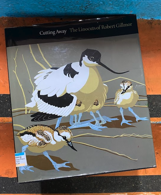
Before cutting into lino, I researched printmakers’ past and present work, studying figures such as Carolyn Trant (Lewes printmaker), Barthélémy Toguo, whose work I admire (and own), Angela Harding, Eric Ravilious, Otto Dix, Matisse, Robert Gilmor, and Lewes Artist Michelle Hockey.
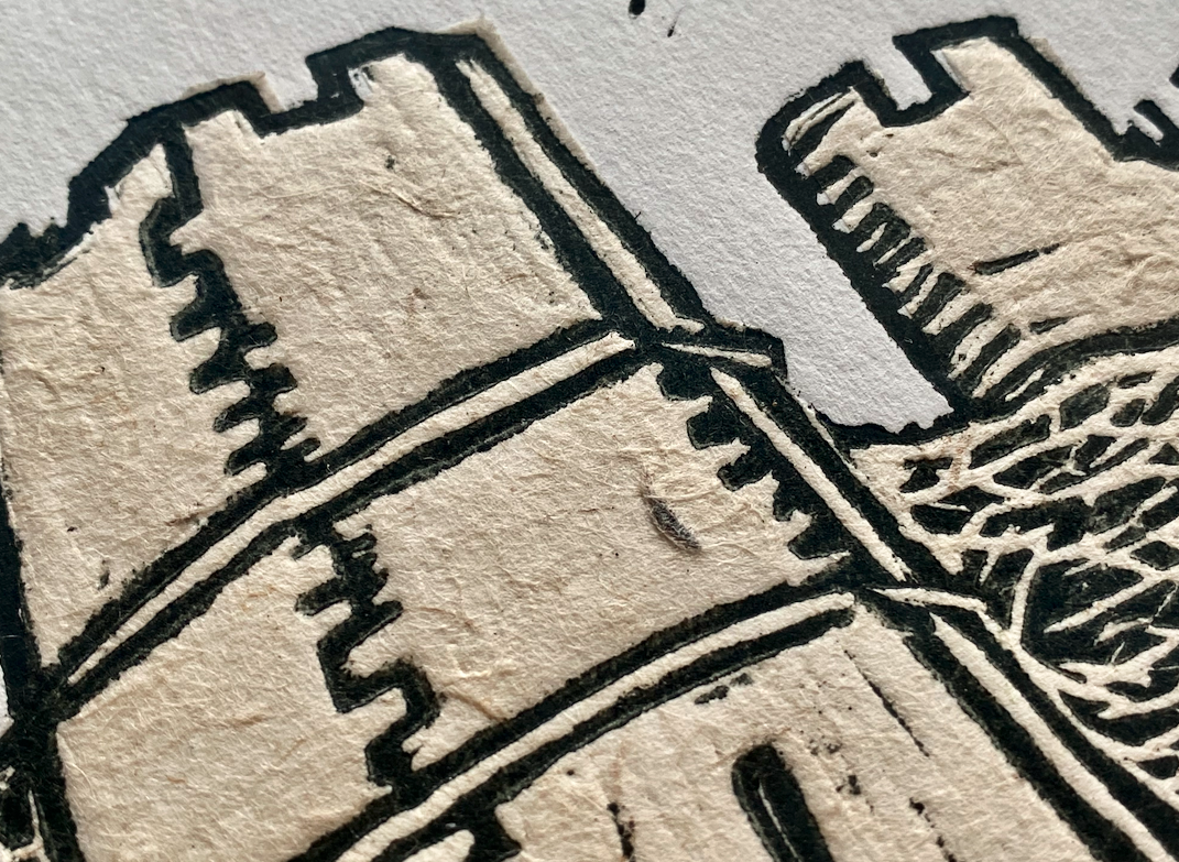
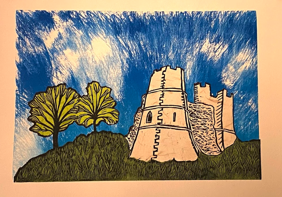
- I explored line weight and carving techniques to suggest texture.
- I managed skies—from stark simplicity to elaborate swirling motion. Helen Brown inspires my contoured chatter.
- I balanced solid areas of ink with carved negative space.
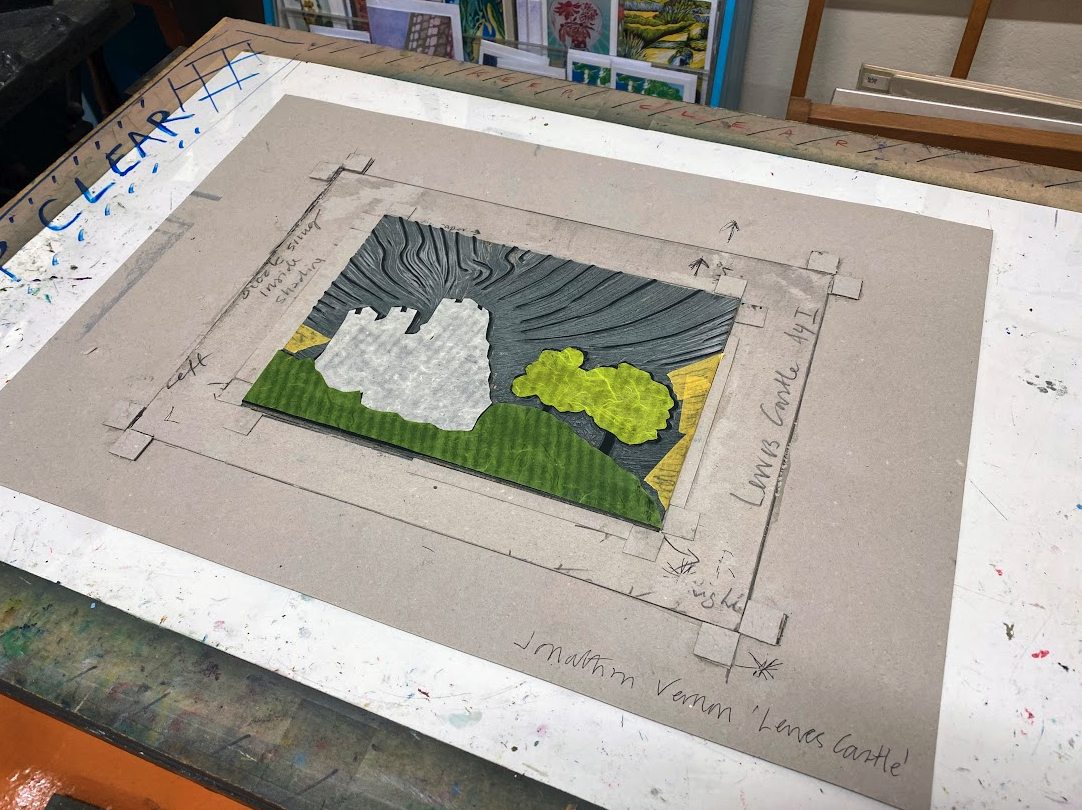
Influence on My Work: I aimed for a bold, dynamic sky, a sense of weight in the castle, and energy in the composition.


Compositional Mock-ups and Playful Experiments
Before carving, I tested layouts using Adobe Express, experimenting with:
- Sky compositions—straight lines, curved distortions, radiating patterns.
- Tree placement—how much foreground weight felt appropriate.
- Frame size tests—how different mounts and frames affected the final feel.
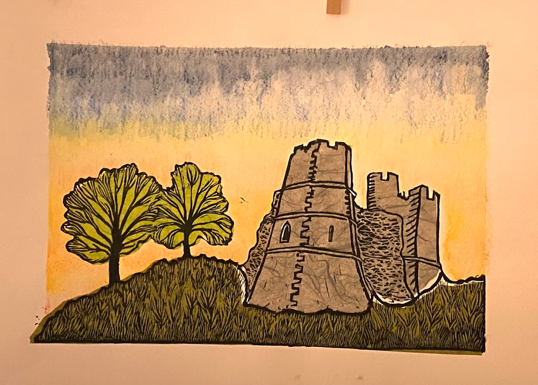
It’s taken me a year or two not to rush into cutting the block. There is nothing worse than going through the many hours of cutting any block, large or small, only to find the print doesn’t work or sit right or has simple errors that could only have been corrected in the first sketches and tests. What I do now is have a period of play. Is this designed to be a chin colée relief print, or is it something else, a mono print, a reduction print, or a jigsaw print? Is landscape the right way to do this, rather than portrait?
The Wild Experiments:
- A silver sky—ethereal but ultimately too overpowering.
- A silver castle—intriguing, yet it lost the stone texture.
- An aquarium version—mound, castle, and trees submerged like a ceramic ornament.


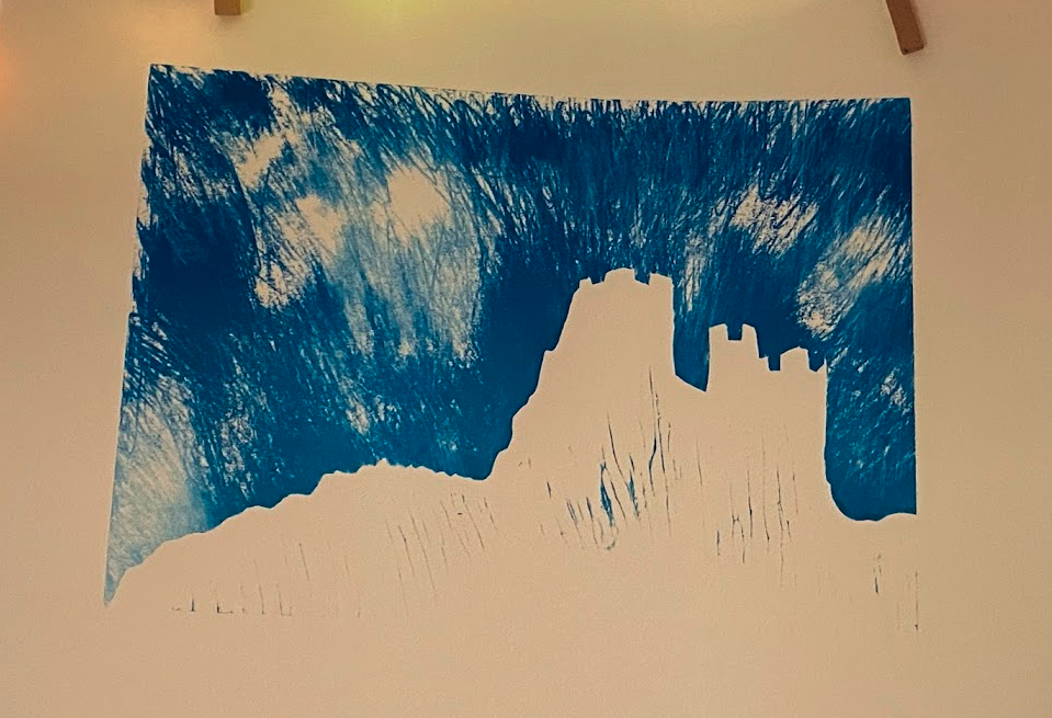
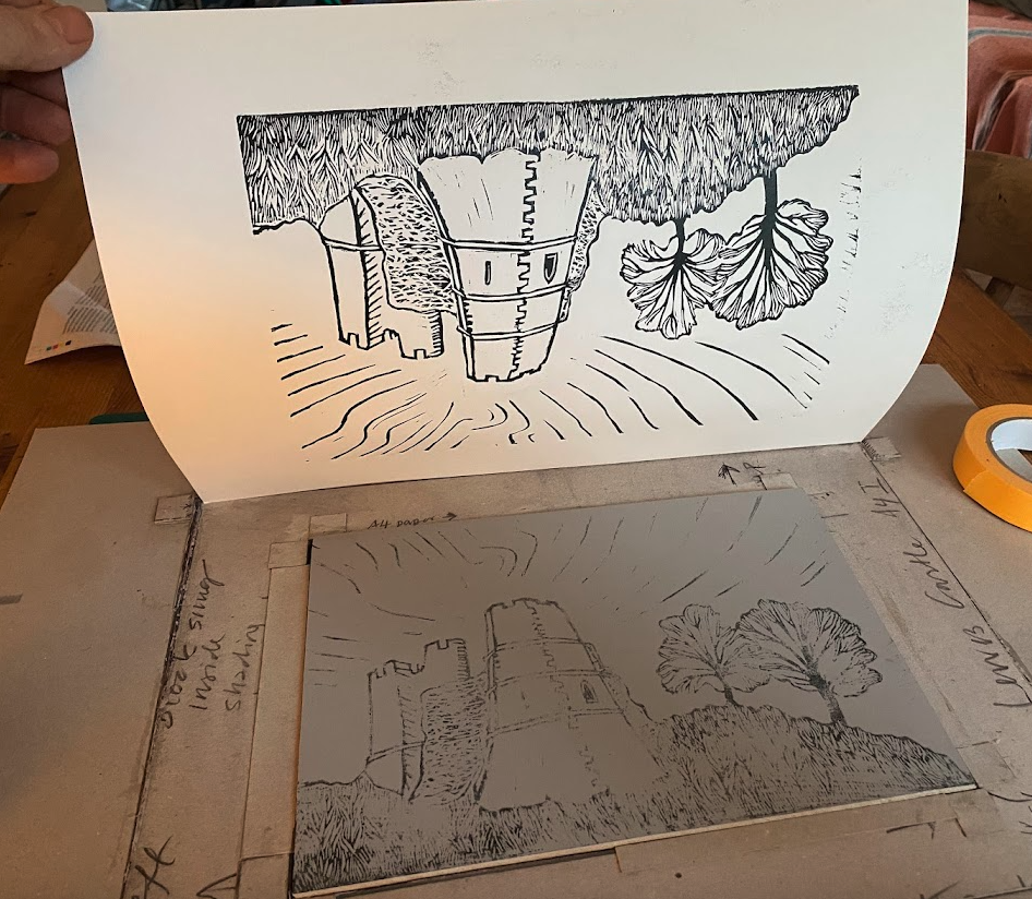
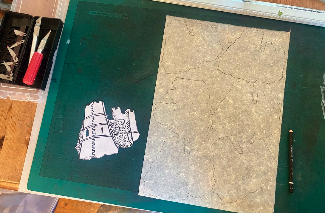
Carving and Testing the Print
Moving from digital to physical:
- First test prints: Adjusting line depth and checking ink coverage.
- Chin collée elements: Deciding where to add layers of subtle colour.
- Final refinements:
- How much to ink the sky versus leaving open space.
- Balancing sharp, architectural lines with softer organic textures.
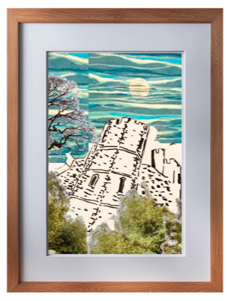
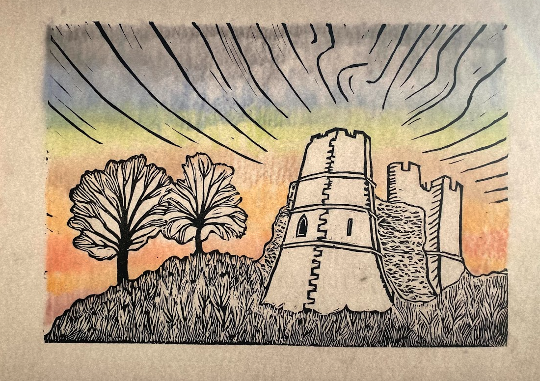
- Print on Fabriano Artistico paper for optimal texture and ink absorption.
- Heading into Bip-Art to print and chat with other printmakers.


The Finished Print and Reflection
After six or seven weeks of iterations, experiments, and adjustments, I settled on this 1/12 edition.
What I’ve Learned:
- The balance between precision and playfulness allows space for surprise.
- The unexpected joy of experiments, even if they don’t make the final cut.
- Studying other artists’ work to advance my style.